
Header
The header is the section that appears at the very top of your Collection page. It usually contains your logo, navigation links menu (such as Home, Collections, or Watchlist), or other user account options.
Enable Header
By default, the header is enabled. If you would like to disable the header and remove the space for the logo and menu navigation, you can turn the toggle switch to OFF.
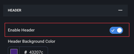
Header Background Color
Controls the background color of the header at the top of the page and includes the background of the dropdown menu.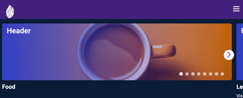
Background Opacity
Adjusts how transparent or solid the header background appears.
Please use a number between 0 and 1 (decimals are supported). If you want no opacity (no transparency) use 1. If you want full opacity (complete transparency), use 0. If you want 50% opacity, use 0.5 or any decimal in-between.
By default, this is set to 0% (not visible)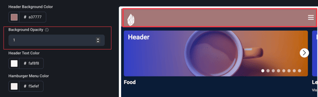
Header Text Color
Controls the color of all text that appears within the header area; navigation links and menu items. Adjust this to ensure your text stands out clearly against your chosen header background or gradient.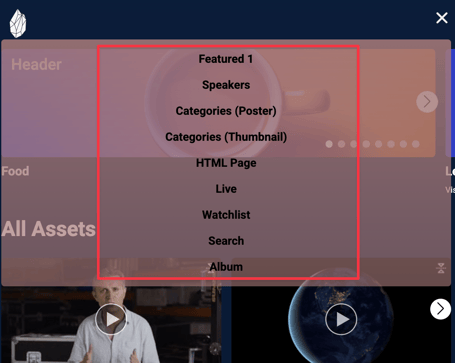
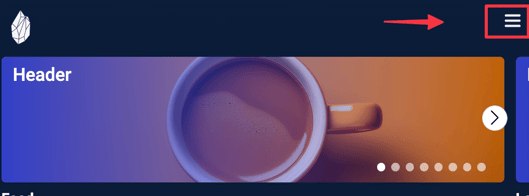
Hamburger Menu Color
Sets the color of the three-line menu icon (often called the “hamburger” menu) in your header. This color determines how visible the menu icon appears against your header background—choose a shade that provides enough contrast for easy visibility.
Logo Image
The image file displayed in the header to represent your site or brand. By default, the site name is shown as text if no logo image is uploaded.
Logo Link
The URL that the logo in the header links to when clicked. Typically this is linked to the homepage of the layout.
Logo Height
Controls the display height of the logo image in the header. By default, this is set to 50.
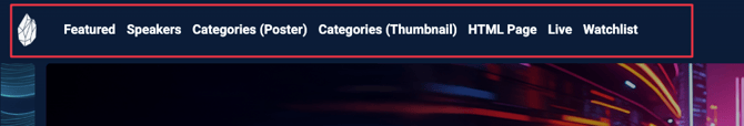
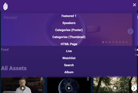
Navigation Links
Navigation links are the menu items displayed in the header that allow users to move quickly between different sections of your site. These links can be customized to match the needs of your event or library, and each one appears as a label or icon across the top of the page.
You can enable or disable each link depending on what content you want to highlight. For example, you might include a Live link during an event, a Speakers link if you want people to browse by presenter, or a Watchlist link so viewers can access their saved content.
Note: You must create a Page before linking to it in the Header navigation.
Click here for more information about Pages
Listed below are examples of navigation link labels you can use:
-
Home – Brings users back to your main landing page.
-
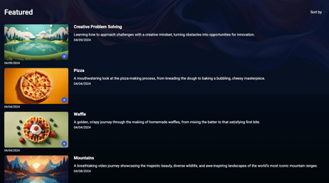
Featured – Highlights your top or most recent videos.
-
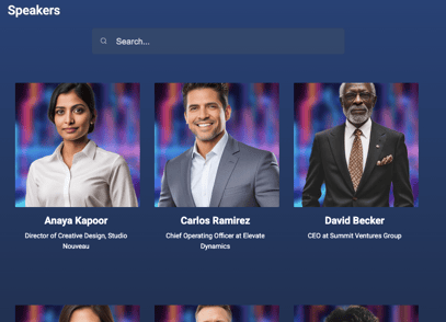
Speakers – Lets users browse available speaker bio information and any assets connected to the presenter.
-
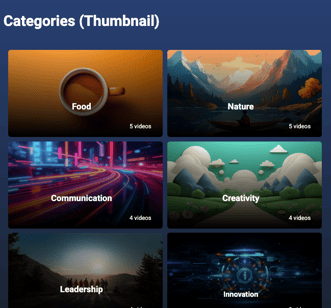
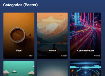
Categories – Displays your content grouped into categories, either with poster images or thumbnail grids.
-
HTML Page - Adds a navigation link that points to a custom HTML page (such as an About page or external resource).

-
Live – Takes users directly to the live stream or event page.

-
Watchlist – Links to a user’s personal list of saved videos.

Search – Opens a search bar page so users can find specific videos or collections.

Navigation links are fully customizable—you can choose which ones appear, what they’re labeled, and where they point.
Show Profile Menu
Controls whether a user profile menu appears in the header. Gives options for logout, account settings, and access to their profile. This should be enabled for any site that is using networking.
Collection 2.0 Layout Overview
- Next Article: Home Page: organize and reorder rows of content shown on the main page.
- Previous Article: Common Colors: Customize colors, icons, and titles in your layout