Recommended Image Sizes for Collection Layout
Updated
Find the exact pixel dimensions, aspect ratios, and on-page placement for every image type used in a Collection 2.0 layout — from thumbnails and logos to hero banners and speaker photos. The below chart breaks down the various images in the Collection Layout by offering descriptions and recommended sizes for each.
How these images can appear on the page
The Collection homepage pulls these images into several distinct sections. Here's what each labeled area on the layout does:
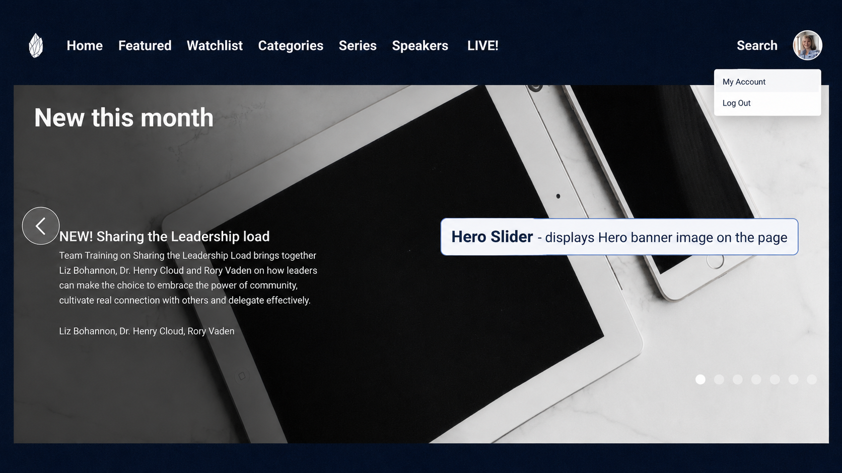
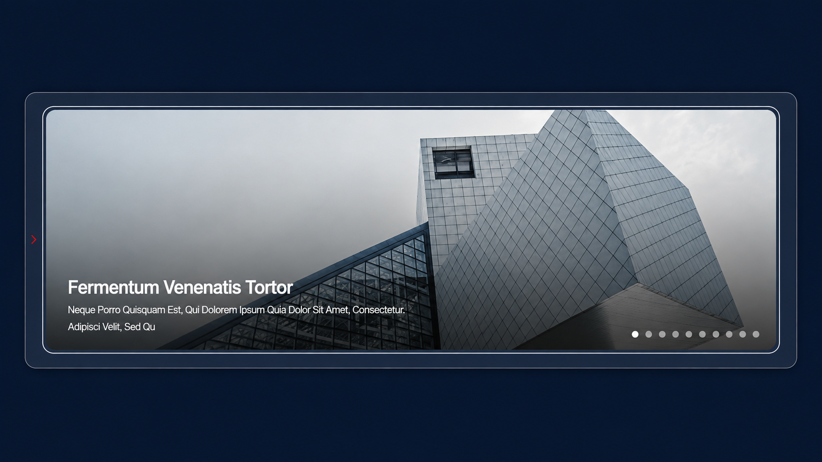
- Hero Slider — displays the Banner/Hero image at the top of the page.
-
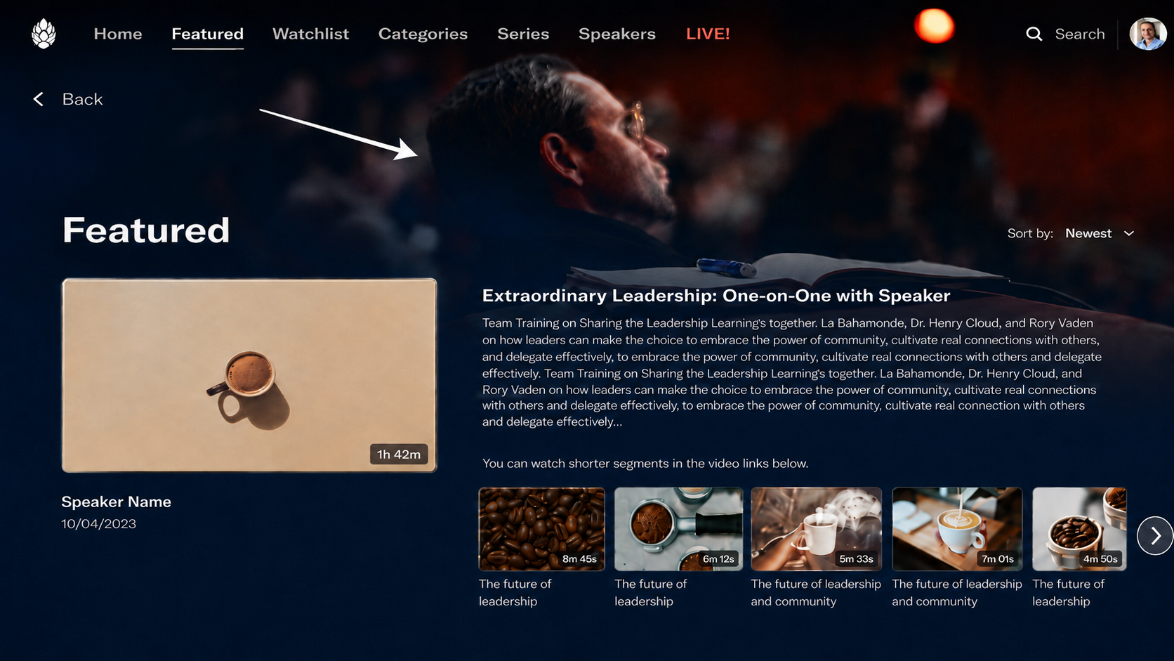
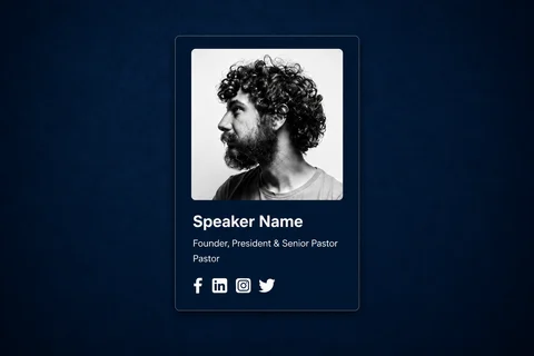
Speaker Image — Shows the bio image, displaying the description below, on the Speaker Page

-
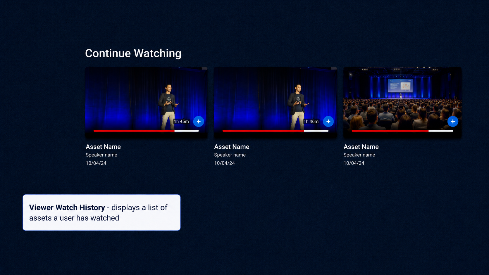
Viewer Watch History ("Continue Watching") — Has thumbnails and shows a list of assets the viewer has already watched.
-
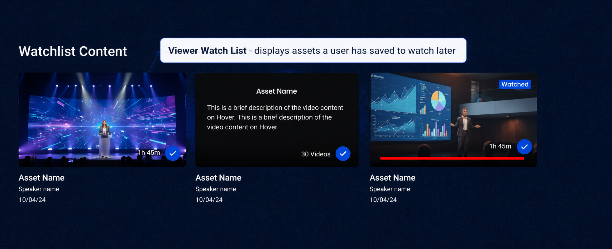
Viewer Watchlist ("Watchlist Content") — shows assets the viewer has saved to watch later. Also displays the thumbnail of the asset
-
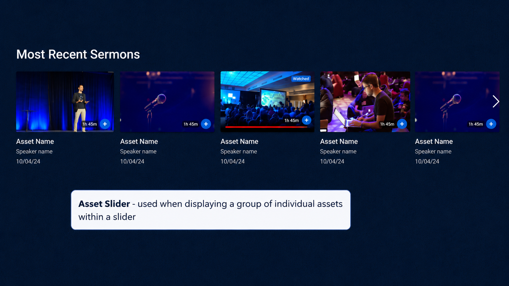
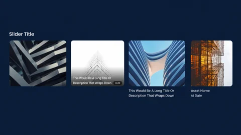
Asset Slider ("Recommended," "Most Recent Sermons") — a horizontal slider of individual video assets, using each asset's thumbnail Image.
-
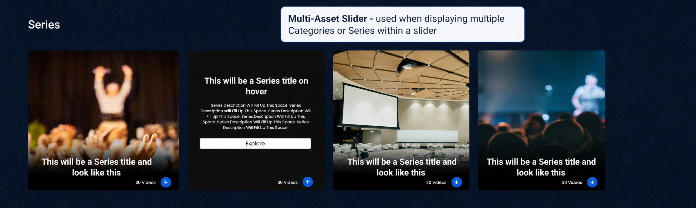
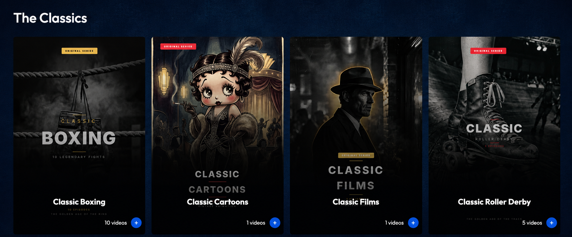
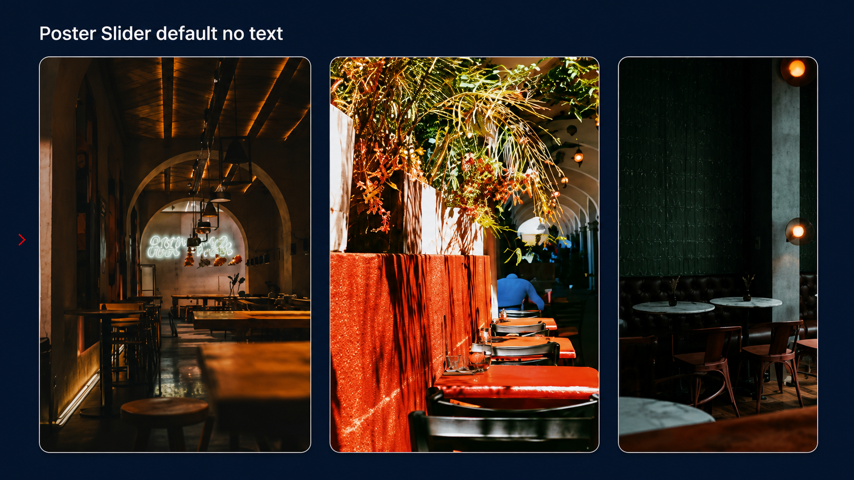
Multi-Asset Slider ("Series", or "Categories") — a horizontal slider showing multiple Series with thumbnails or Categories, using the cover (Poster) image.
-
Vertical Assets Grid ("Tags," "Asset Grid") — a grid layout showing a group of individual assets with thumbnails.
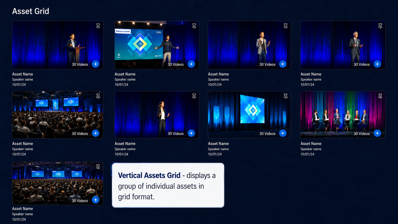
Image Sizes
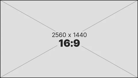
Thumbnail Image
A small image often shown in a grid should look good as less than 300 px wide, but often shows as small as 150 px Used for: Grids, watch history, asset sliders
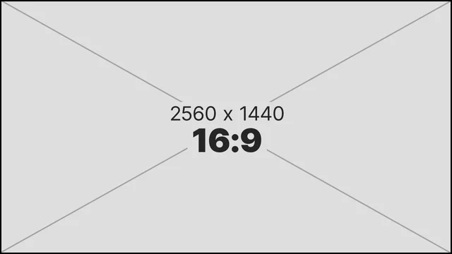
Recommended size: 2560x1440 / 16:9
Speaker Image
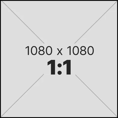
A speaker image for a specific bio.
Used for: Bio-specific (speakers page)
Recommended size: 1080x1080px / 1:1
Logo Image
Text or image with a transparent background, typically placed in the upper-left of a Collection layout's navigation bar and in the footer. It doesn't have to be perfectly square, but it should be a high-quality image. We recommend adding a favicon for the collapsed/mobile menu view. Used for: Navigation bar / footer
Recommended size: 800x800px (1:1) or 420x70px (6:1)



Cover (Poster) Image
A vertical poster image, similar to a print movie poster. Used for Series and Categories.
Used for: Series & Categories
Recommended size: 600x900px / 2:3
Banner (Hero Image)
Used as the background for the hero section at the top of the page. In Collection, this image populates the Homepage Main Hero Slider.
Used for: Homepage hero slider only
Recommended size: 1920x480px / 4:1

Background
A larger optional background image that can be displayed on the homepage or a subpage behind any existing content. Used for: Optional subpage background within an asset/series page
Recommended size: 2560x1440 / 16:9