Custom HTML Sections (Collection 2.0)
Updated
A Custom HTML section lets you add your own markup to your layout. It’s perfect for adding buttons, banners, link lists, and call-to-action (CTA) areas inside your Home Page or My Account sections that point users to internal pages or external sites.
How to add a Custom HTML section
-
Open your layout (e.g., Collection 2.0 → Home Page or My Account).
-
For Home Page, add a Custom HTML Section
-
For My Account, choose Add under Custom Rows
-
-
Select Modify HTML to open the HTML editor window.
-
Copy and paste one of the provided HTML templates (or your own code) into the editor.
- You can adapt it with custom text, links, or buttons as needed. -
Click Save, then check the Channel Preview to confirm the content appears correctly.
Templates
1. Simple Text Link (inline)
This is the most basic option. It turns a word or phrase into a clickable link.
- Use it for: linking to another page (like your “About” or “Contact” page).
- Example: “Read our statement of faith.”
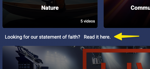
Looking for our statement of faith? Read it here.
**
2. Link List (clean, compact)**
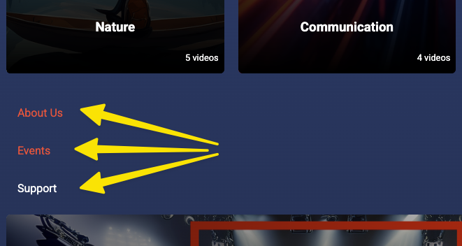
Creates a clean list of several text links stacked vertically.
- Use it for: menus, resource lists, or quick navigation links.
- Tip: Add or remove
<li>lines for more or fewer links.
3. Image Banner → Clickable Link
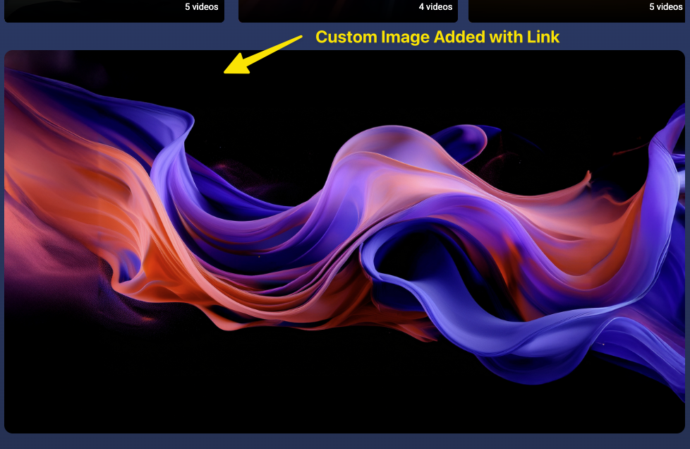
Shows a large image that acts as a clickable banner.
- Use it for: promoting a featured series, event, or announcement.
- Tip: Replace the
srcURL with your own image link.

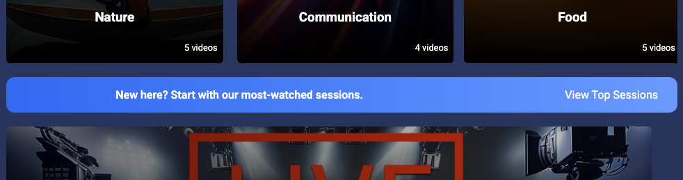
4. CTA Strip (Full-Width Callout)
Adds a full-width colored bar with text on one side and a button on the other.
- Use it for: announcements, featured messages, or big calls to action.
- Tip: Adjust the gradient colors to match your site theme
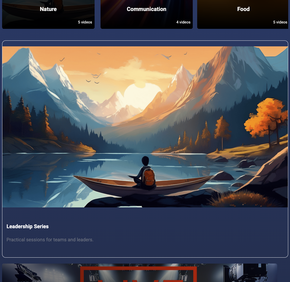
5. Card Link (Image, Title, Description)
Shows a clickable “card” with an image, headline, and short text.
- Use it for: featured content previews (like a sermon series or event).
- Tip: Replace the image and text to match your content; users can click anywhere on the card.

6. Quick Copy Block (Mixed Links)
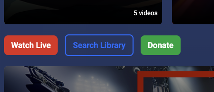
Combines multiple buttons with different colors or actions in one flexible row.
- Use it for: quick-access buttons at the top or bottom of a page.
- Tip: Adjust colors to create a visual hierarchy (like red for “Live” and blue for “Search”).