
Title Font Color
Controls the color of titles and headings throughout the layout. By default, this is set to white (#FFFFFF).
Body Font Color
Controls the color of standard body text on the layout.
Background Color
Determines the overall background color of the layout.
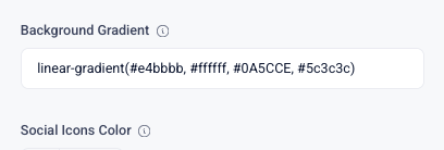
Background Gradient
Controls the gradient applied to the overall page or section background. This can be customized with multiple colors to create a smooth visual transition (i.e. light to dark) instead of a flat background color.
To choose multiple colors you will input a hashtag and color code with a comma, and then another hashtag and color code within parentheses i.e. (#d31919, #e43bbb) Following this pattern you can input however many colors you desire.
Social Icons Color
Controls the color of social media icons displayed in the layout, at the bottom of the page. By default, this is set to white (#FFFFFF).
Button Background Color
Controls the background color of buttons. By default this is set to blue (#0A54CCE)
Button Text Color
Controls the font color of button labels. By default, this is set to white (#FFFFFF).

Asset View Background Gradient
Controls the background gradient that appears behind the video or asset view when you open it. Instead of showing a flat solid color, you can blend two or more colors smoothly.. This can be customized to enhance contrast or match branding.
For more explanation and templates on gradients click here
Once you have finished customizing your sections, click "Update" at the bottom of the page to commit all of your changes. You also have the option to undo all changes you've made to the layout since the last update.
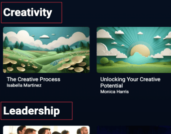
Collection 2.0 Layout Overview
- Next Article: Header: control the colors, logo, links, and menu shown in the top bar.
- Previous Article: Common Settings: edit shared text and images across the layout.
- Related Resource : Background Gradients: apply blended color effects to backgrounds.